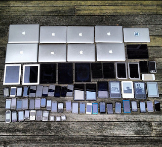
The “fold” on the web is a controversial topic. I personally believe that the web is different from print (where the term and concept originated) in that it is interactive.
Scroll bars and touch controls allow users to manipulate their viewing experience more and more with each new device and browser. Also, “mobile” internet use will surpass desktop use by 2014 (Update: it actually didn’t happen until November 2016,) meaning that any concrete identification of the fold will be out the window.
Obviously there are cases where putting content near the top of a page can be beneficial, since most if not all browsers render pages with the starting point scrolled to the top (is top a relevant term when describing page location anymore? Especially since devices can be rotated and turned more than older monitors ever could.) But I believe that is different from expressing that something be entirely or mostly “above the fold.” There should always be a content hierarchy and browsing trends will usually point to people scrolling from top to bottom to support this.
Responsive design especially defeats the concept of the fold since it makes the “fold line” a floating and ever-changing border. Instead of concentrating on what should be above or below a line that may or may not even exist in a majority of cases, I believe authors should instead focus on a consistent hierarchy of content and embrace the ambiguity of the web.